 Blog
Blog
The SEO Benefits of Responsive Web Design

A responsive website design creates a huge opportunity for brands to reach and interact with mobile customers. It ensures that your site is accessible, meets current web standards, and brings in new clientele from mobile devices. However, there is more to responsive web design than making an aesthetically appealing website.
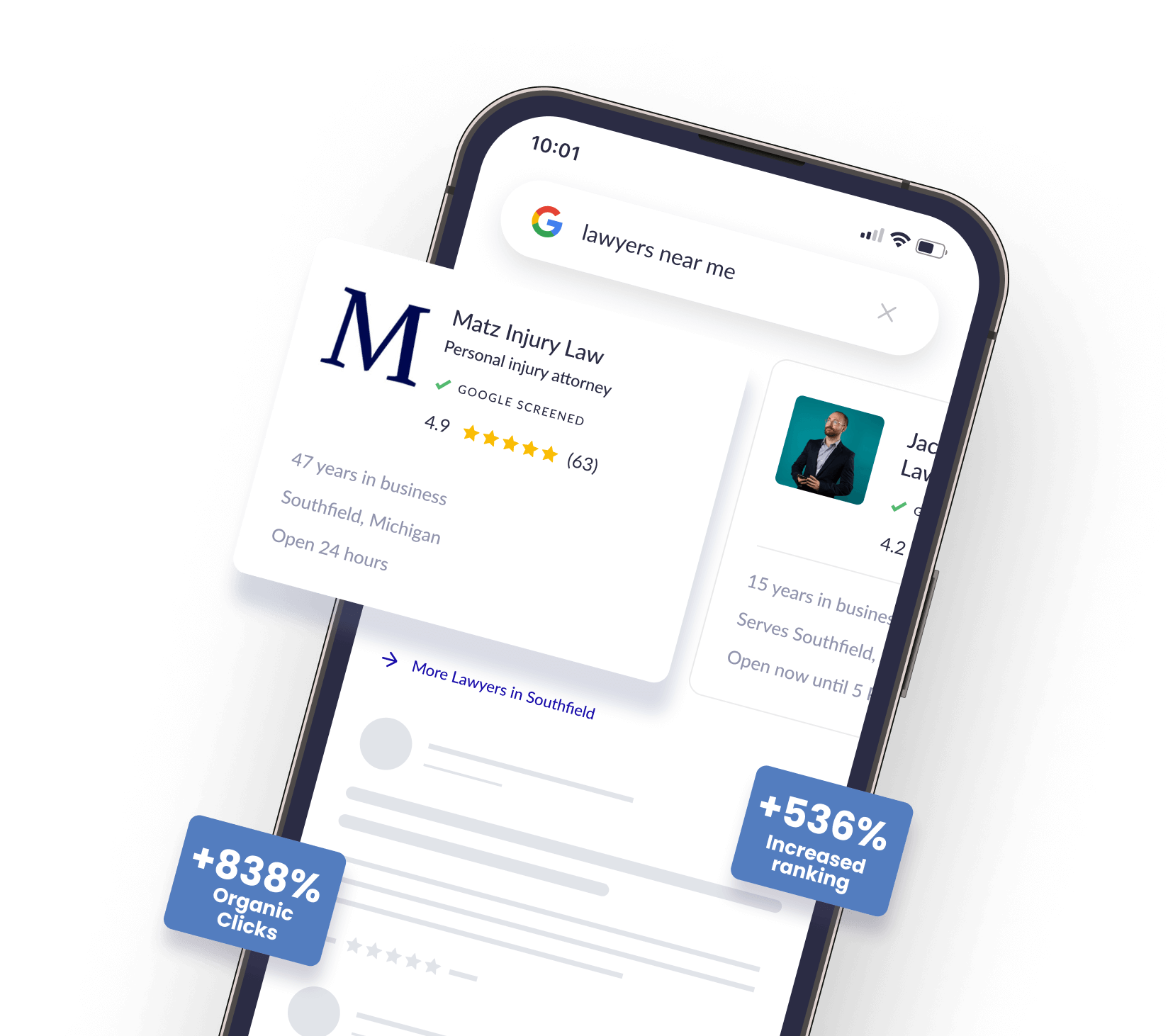
A website is a critical part of your business, but it is only helpful if prospects can find it through a search engine like Google. Google’s algorithms are constantly changing to ensure the content in the search results is relevant, making it difficult to keep your search engine optimization (SEO) efforts up-to-date. Regardless, a mobile responsive website is key for holding the first position in search results.
Though often overlooked, a mobile-first marketing strategy adds value to your brand by connecting with consumers in the moments that matter. If you need help creating a responsive website or just want to talk about your options, call Array Digital at 757-333-3021. Our team of web experts can help you create a beautiful website well optimized for search engines.
How could your firm benefit from having a responsive, mobile-friendly website? Read more for the answer.
What is responsive web design?

The goal of responsive web design is to build a site that is wholly visible and functional on devices of all screen sizes. This approach focuses on how users may engage with the website based on their screen size (mobile phone, tablet, or desktop, for example), platform, and orientation.
The process of creating a responsive website, then, includes the use of various grids and layouts designed to be more flexible. If a person uses a website on their MacBook and then moves to their iPhone or sends a message to a friend using an Android device, the site should function the same across all platforms, creating the same overall experience.
Also known as RWD, responsive web design is a modern web design technique that allows website pages to adapt automatically to whatever device or platform the user is on, even large smart TVs.
How does it work? The method uses Cascading Style Sheets (CSS). How the website appears depends on factors like orientation, screen size, and resolution, as well as properties like the color capability of the user’s device, making it possible to create a more versatile and flexible website.
With this method, we do not create just one web page that’s 800px across and centered on the screen. Rather, this method uses various elements of shape and size and then places them on the web page based on the width of the user’s browser screen.
Why is mobile responsiveness important in SEO?
As a managing partner, you may not have much experience with the background functionality of web pages, HTML, or design techniques. What is important is understanding how a responsive site creates a better experience for your current and potential clientele.
The primary goal of any website is to ensure a phenomenal user experience. That means your ideal customer can use your site, gain the information they need, and make a buying decision. With responsive web design, we can do that no matter how your clients are reaching you, such as from a mobile site.
8 reasons why mobile responsiveness is important for SEO
Let’s talk about your digital marketing strategy — the work you are doing to optimize your website to draw customers to it through search engines. SEO is critical for building your business brand, getting customers, and keeping people coming back. To appear in Google search, you must optimize your website for search engines. Search engines like Google consider responsive web design a ranking factor, meaning if your site usability is low or lacking, Google will not rank you high on the search engine results page (SERP).
Here are the eight reasons why mobile responsiveness is essential for SEO.
1. Search engines prefer a responsive site

Paying attention to what Google loves is imperative to your success online. Google clearly favors mobile-friendly websites considering they rank over sites without a responsive framework. Thus, the goal of a responsive website is to appeal to both viewers and search engines.
Mobile users make up a large part of the searches that take place on the platform. If Google ranks a website that does not work, Google is failing its searcher. Nonresponsive sites are often slower, harder to use, and have high bounce rates, meaning that searchers using a mobile phone will often hit the back button and try a different site. Google ranks websites by page speed and how users behave on the site. If your site isn’t easy to use, GoogleBot will not rank it well.
Since consumers tend to trust higher-ranking companies, targeting mobile users through a responsive website that gains visibility in online search results should be a priority. Making your website available to potential customers no matter where they are or what device they use will win over their hearts…and wallets.
2. The majority of online traffic comes from mobile phones
Most consumers go online via mobile devices, making a mobile-friendly website necessary. In fact, 71% of total digital minutes in the United States originate from mobile devices. Consumers spend more than 15 hours a week researching on their smartphones, and 48% of consumers start their research on search engines. That is why search engines take mobile responsiveness into high consideration when determining search result rankings.
Having a mobile responsive website gives you a significant boost in search engine ranking, but it’s also something that every business needs to stay relevant and useful to prospects. If the site jumps around when they are trying to use it or is not easy to navigate on different devices, the user experience fails, and that’s frustrating. When a website is not mobile-responsive, users may move on to your competitor’s mobile-friendly site — thus increasing your bounce rate. Imagine getting people to your website, knowing you have what they need, but your mobile web page is so hard to use that they leave. That stings.
Most website templates have a design to be mobile responsive; if you don’t start with this type of template, you will struggle to make the necessary adjustments to optimize your site for mobile. Keep in mind that sites built with a mobile responsive template may still need minor CSS additions to hide or display elements on certain screen sizes. Use Google’s mobile-friendly test to ensure your website displays correctly on mobile devices. If your website is from 2014 with no updates, it’s time to build a mobile-responsive website.
3. It decreases bounce rates
You know what they say about millennials: they’re impatient. Whether or not this is actually true, if it takes several seconds to load your website, they are leaving in favor of a faster competitor website. This goes for older and younger generations, too.
People become easily frustrated with companies that do not have mobile-friendly and intuitive websites. How many times have you visited a website and had to pinch and zoom in on content to be able to read it? Did you stay on the website long? Probably not.
Accessibility is key. Your website viewers want to be able to tap on your phone number to place a call and click on your address to get GPS directions to your place of business. In our technology-driven society, using poor design will plummet the potential of your website incredibly quickly.
A website lacking responsive capabilities also implies that your business does not care about staying up to date, leaving potential customers with a lasting, negative impression of your brand. Web pages with long loading times, poor functionality, and non-working features like JavaScript or images that are too large to see the words on a page will lose website traffic instantly.
Mobile is its own experience, and there is no doubt that it has changed how people make purchasing decisions. By putting yourself in the consumer’s position, you understand how an outdated website detracts from their experience online and can ultimately lead to less traffic. As the world continues to “go mobile,” it is critical for consumers to have access to your website on any device at any time. If your site is instantly accessible to users on various devices, you will keep bounce rates low and customer satisfaction high as they engage with your brand online.
4. Search engines penalize duplicate content
Now, this might be a bit misleading. If you’ve been trying to improve your website performance and ventured into SEO, you might have heard that Google will penalize you for duplicate content. This is not necessarily true. Google doesn’t go around putting bans on law firm sites that have similar information across blog posts. However, there is some nuance here as to how Google’s crawlers handle this issue.
Before responsive design came along, many websites gave users the option to click on either the desktop or mobile view, which linked to different URLs. That meant there were two sites that contained the same content with different URLs. That redirection to one of two sites was often confusing to users.
If there is duplicate content across a website, Google won’t penalize the site, but rather Google will have to choose what to rank, and it typically ranks pages incorrectly. More so, if Google directs people to your mobile website on their desktop or vice versa, that could create user experience problems.
From an SEO perspective, it is better to have a responsive website developed rather than navigating viewers to a separate URL for the mobile version of your website. Responsive design eliminates the need to have two versions of the same website. Since responsive websites use only one URL, it is painless to optimize the site for search engines, and it makes it easier for Google bots to crawl and index its content.
5. Mobile websites load faster, boosting user experience

Most searchers experience slow-loading sites from time to time. How long do you actually stay on a website before you become so frustrated you just go back to the search results to try another page? Page speed is so impactful to the user experience that Google updated its ranking factors to include web page loading speed. Google uses the mobile site speed as a mobile search component.
As you work to make your site SEO-friendly, you must consider the impact of faster loading. Even if you don’t look at ranking as a factor, you may see a huge improvement in conversion rates when people stay on the site longer because it loads faster. Mobile pages that don’t load don’t keep people around for very long.
6. It increases social shares
How does social media matter in mobile-friendly design? When people use social media apps, they engage with them on their mobile phones heavily. Those share buttons on each post are critical to building your brand and reach.
People only share what they like. A responsive design makes it easier for viewers to engage with your website and benefit from it. They may even share it with their social network, expanding your reach. Many law firm sites keep social sharing capabilities front of mind, such as making it easy to access share buttons.
Social shares don’t directly affect your mobile SEO efforts as they don’t influence direct ranking. However, Google directs more people to websites that get more traffic, which could mean more customers thanks to increased visibility. Responsive design and SEO really support each other.
7. It makes it easier to build backlinks
If your website and mobile site are on two different links, backlinks are a problem. Backlinks are links on other websites that point people to your site. They are a core component of a solid SEO ranking and play a role in the ranking metrics search engines use.
When there are two different versions of your site, it makes it harder for SEO professionals to build backlinks, and that’s needlessly limiting your strategy. Marketers include backlinking as a part of the SEO strategy on every site, but most won’t bother with two separate URLs. Having just one site is flexible, versatile, and effective.
8. It improves conversation rates
The bottom line benefit of any website is converting website traffic into profit. Take a look at Google Analytics. Do you notice that desktop users convert better than mobile users? If so, your mobile design may be flawed and costing you money. When you move to a responsive website design, you get a better user experience which translates into more conversions. A redesign to a more adaptive website is a great investment for most companies.
Top the SERPs with responsive design
Although changes from Google necessitate constant monitoring of your SEO strategy, maintaining a mobile-responsive website will always help keep your website at the top of the results page.
Are you tired of searching for your business and seeing your competitors? The web development experts at Array Digital can help your website be front and center for relevant search terms. Show off your expertise with a stunning website.

Everything you need to know about hiring a digital marketing agency:
- The four pillars of digital marketing
- Digital marketing options and costs
- The pitfalls to avoid
- What to expect when working with an agency
- The qualities to look for in a digital marketing agency


-

“Erik and the Array Digital team are top notch in the digital marketing spaces, particularly for SEO. Their understanding of Google, the algorithms, and the work involved to get websites ranking on the first page is unparalleled. Thank you Erik!!”
Andrew Zihmer -
“I had a chance to consult with Kevin Daisey for my law firm’s marketing needs. He is knowledgeable, kind, and helpful. He provided me with a great marketing analysis. He also invited me to their podcast as a guest speaker. Thank you Array Digital!”
Merve Kati -
“The legal profession needs more architects and designers…folks who are thinking about the future of the profession and who are assembling a tribe of like minded lawyer leaders. Erik and his team are certainly ‘that’.”
Ben Glass