Branding For Law Firm Websites
“You will not be stopped from arguing if you wear a race-track suit or sport a rainbow necktie. You will just create a first impression that you have strayed in at the wrong bar.” These words from U.S. Supreme Court Justice Robert Jackson underscore the value of making good first impressions for lawyers. In 2023, your first impression with a potential client is most likely going to happen online, and your branding is your appearance. Do you want to be sporting a rainbow necktie or a well-tailored suit? This guide will teach you how to tailor your law firm’s branding so you can always leave a good impression.
Understanding the importance of branding for your law firm website

Website design often focuses on functionality — the way the website works, the search engine optimization (SEO) of it, and the perfect calls to action. Yet, your law firm branding is just as important to get right.
Branding is the visual identity of your law firm. It includes elements like:
- Your law firm logo
- Your law firm color scheme and website color palette
- All other imagery or design elements used to help support your position in the legal industry
Branding is the first impression that potential clients have of your law firm. It’s essential that it conveys the identity that you want to project. The right color and styling help you to make your brand stand out and also help people to remember and recognize your law firm when they see your ads.
Branding also goes a long way in making your website visually pleasing and easy to navigate. Bad branding can drive away potential clients just as much as good branding can draw them in. Our team at Array Digital can help you take your existing brand and elevate it across all of your marketing challenges to create the perfect visual representation of your legal services to your target audience.
Defining your law firm’s brand identity
To start building your firm’s branding, you need to define the identity you want to project to the world. To help with this aspect of legal marketing, ask yourself the following questions.
Who is your target audience?
This is the group of people most likely to reach out to you — the client you want to have contact you. If you are looking for a wealthy client base, you need to choose a color palette and branding scheme that conveys luxury and refinement. If you want to be approachable to potential clients of any financial background, your branding should be polished but not intimidating. There’s a big difference, for example, between a criminal law firm and a family law firm.
Your website design needs to reflect, at least in part, the colors and details that will help the prospective client want to connect with you, feel like they are in the right place, and ensure they feel comfortable reaching out to you.
What is the tone you want to convey?
Ask yourself what impression you want to give of your firm and law office. Do you want to be seen as competitive and fierce? Choose different colors to convey this message instead of a more subtle color choice if you want to be seen as compassionate and caring. Perhaps you want to convey dignity and professionalism. You may want to create a sense of power and aggressive legal support, such as in pursuing the needs of your personal injury client.
All of these can impact the branding your choose. The best colors should create the feeling you hope potential clients experience when they land on your page.

Selecting the right color palette and typography for your law firm brand
One of the words we hear often is “right” — what are the right color combinations for your law firm or the right colors for an emotional response? Ultimately, you can incorporate the colors you want, but there are some key factors to keep in mind.
Choosing your color scheme

Your branding should rely on a small color palette, typically one dominant color and one or two accent colors. Your colors should be complementary and not clashing.
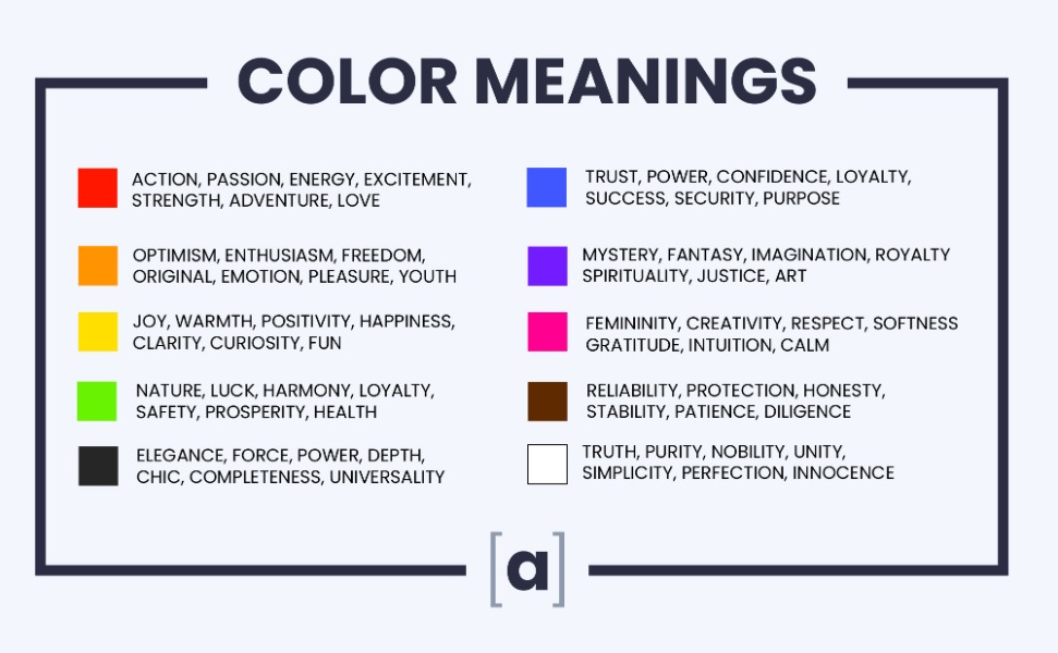
To understand this, we need to consider color theory and how to pick complementary colors. Color theory is the understanding of how colors impact a person’s mood, emotions, or feelings. While we could go into detail about the psychology behind colors, let’s just talk about some of how color theory impacts your law firm’s clients.
The color wheel, invented in 1666, shows colors in a circle, providing insight into the relationship between them. There are three primary colors from which all other colors come: yellow, blue, and red. We then have secondary colors, which are two primary colors mixed together, like orange, purple, and green.
When choosing a color scheme, we want to look for analogous colors or those that sit next to each other on the color wheel. When used together, they create a soothing and matching feel. However, when you want to excite people, you’ll look for colors that are contrasting.
What does all of this mean for your color combinations? Consider how color can play a role.
Blue is one of the most common main colors for law firm branding. This is partially due to the general pleasantness of shades of blue, from light blue to dark blue. However, blue is also associated with confidence, trust, power, and professionalism.
We also see accent colors that are in more neutral tones. In some cases, they will be complementary shades to the primary color or those next to each other on the color wheel.
Now, you do not have to choose blue. If you have a law firm that deals with a more creative niche, then you’ll certainly want to choose colors reflective of that. For example, if your law firm focuses on intellectual property and trademark law, you may want to choose a brighter or even a fun color combination to bring excitement to the website design. There are no constraints on your ideal color palette.
Choosing your typography
Color gets a lot of attention, but beyond just color, we need to look at typography, too. Typography matters in the way tone matters in speech. Your words may not change, but variations in tone carry variations in meaning to your listeners.
Whether it’s the typography of your law firm’s logo or the font used on your website, your typographical choices influence how your audience receives your message. For an in-depth analysis of all aspects of law firm typography, you can read Typography for Lawyers by Matthew Butterick.
Logo fonts
There are several considerations for how words appear on your logo. This includes differences in the spacing of your letters and whether you use a serif or sans serif font (or even a mixture of both of these). Other factors include the heaviness of the letters you use and the font size or sizes you use. These formats matter in, again, the way the brand is perceived.
Above all else, make sure your font is easily readable. No matter how elegant the font is, if your target audience cannot read the name of your firm, it does not matter. It is not doing its job.
Typography on your website
Readability is everything. Your audience will not stay to read your words, no matter how helpful they are to them, if it is difficult to read. Make sure your type is not too small, and the visual contrast with your website background is easy on the eyes. Using dark colors on a dark background doesn’t work because there is not enough contrast to allow the words to stand out, for example.
You also want to consider accessibility. Be sure that those who may not have excellent vision can still see the practice areas and navigate your site.
Different fonts can be used to signal different parts of your website, too. For example, you could use one font for the content of blog posts, one for headings, and another one for any clickable buttons. This helps to encourage people to click. All fonts should look cohesive, though, and stay consistent across the entire web design.
By combining a specific font with an eye-catching color from your color scheme, you can create clickable buttons that compel users, increasing your click-through rate. For example, if your website features a blue color, you can use bright or darker colors for links you want people to press, like to schedule a consultation. Their eye is drawn to these areas, allowing you to get them to the ideal site.
Creating a law firm logo design
Your logo colors, style, and graphic design will play a role in your website design and everything else you do, including the business cards you hand out and the company letterhead. It’s important to work to get this right.
Your logo represents who you are as a law firm. The first step in designing it, then, is to answer a few key questions:
- Why was your firm founded?
- What values are at the core of your law firm?
- Who are your competitors?
- Who is your audience?
- What are your goals?
By answering these questions, you’ll get a good idea of what your logo should evoke. You’ll also have an idea of what your competitors’ logos look like so you can stand out from the crowd.
As you work to create your logo, consider design elements that could help your logo pop. That could include a graphic or a monogram, for example. These are visual shorthand for your law firm, and they could make your logo visually distinct enough to trademark. That’s important because trademarking your logo can help you to protect it from others hijacking your reputation for their own gain. You’re putting plenty of time into building your marketing and branding. You don’t want someone else to profit from it.
We encourage you to put time and work into your logo design. Consider outsourcing the final design elements to a professional specializing in law firm logos. There are free and low-cost programs you can use online to draft your logo and even a template or two you could follow. However, do you really want to take a chance on something that’s this critical to your law firm’s brand?
Graphic artists can take the information you put together — your ideas — and then create something truly eye-catching and meaningful. This ensures your law firm’s professionalism and polish are apparent.
Choosing the right images and visual elements to enhance your law firm’s brand

At this point, your website has a consistent and cohesive aesthetic. It’s now time to maintain that with the images you include on your page. Images are necessary. That’s especially true when there are large blocks of text you need to provide to your audience.
Visuals help to break up those blocks. They add interest and help to encourage the reader to keep moving through the page. No one likes to look at a page full of words. When you add photos to your site, you help to break up the page without overwhelming your client. Readers can take in more of the information you provide to them as a result.
Most readers will not stick around when they become overwhelmed with too much content.
How do you choose images, then? There’s quite a bit to focus on here, but let’s start with the legalities.
The most important thing to remember when choosing images is choosing images you have a right to use. The best way to avoid copyright violations is to use images that you license from a stock photo website like Shutterstock or Adobe Stock. You can also use your own original images.
Next, consider the overall quality. Your images should all be:
- High in quality
- Not blurry in any way
- Not pixelated
Even if you take your own photos, you need to be sure they are impeccable. Remember, this is the perception you are giving your potential clients. Be sure you’re using a professional or ensure professional-like quality is present (right down to the lighting).
Use visual contrast to break up the different sections of your website. For example, your primary color from your color palette should be prominent on the page. Your calls to action should be in a contrasting color from that palette so they are easily visible. That contrast will be more likely to draw a reader’s eye and get clicked as a result.
You also want to check your background color’s contrast with the text on the page. Be sure that everything is easily readable. One of the most common ways to do this is by using dark text on a light-colored background. However, you can also use light text on a dark background. This helps the reader to see what’s written and move through your page. The key is to create visual interest to keep their eye moving.
Integrating your law firm branding across all of your marketing channels
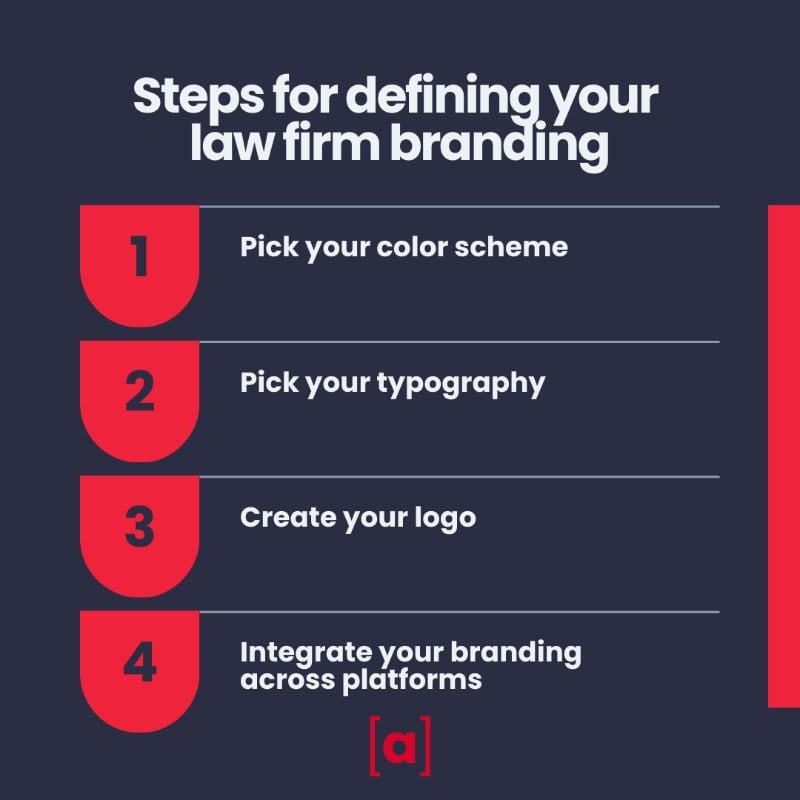
It can be a lot of fun and rewarding to reach the point when you perfect your law firm’s aesthetic, and you love the way it all looks, from the logo to your colors. Now, let that same color scheme, typography, and logo into every aspect of your law firm marketing.
This step is crucial. We want to be sure there is a cohesive look across all of your platforms, from your website and blog to your social media (and even those business cards!) In fact, your business cards, letterhead, email signature, and all other visual branding for your law firm (perhaps even your physical signage at the office) should feature the same logo and coloring.
If you are incorporating infographics for your website or social media, be sure the same fonts and colors from your website and logo are incorporated. This creates a signature look that improves brand awareness over time. As more people start associating that particular visual with your law firm, you’ll effectively build your brand.
Tailor your brand, refine your message
Allow our team at Array Digital to offer the guidance you need. Reach out to us at 757-333-3021 now to set up a consultation. We also have a form for same-day contact. Let us help build your brand!
