 Blog
Blog
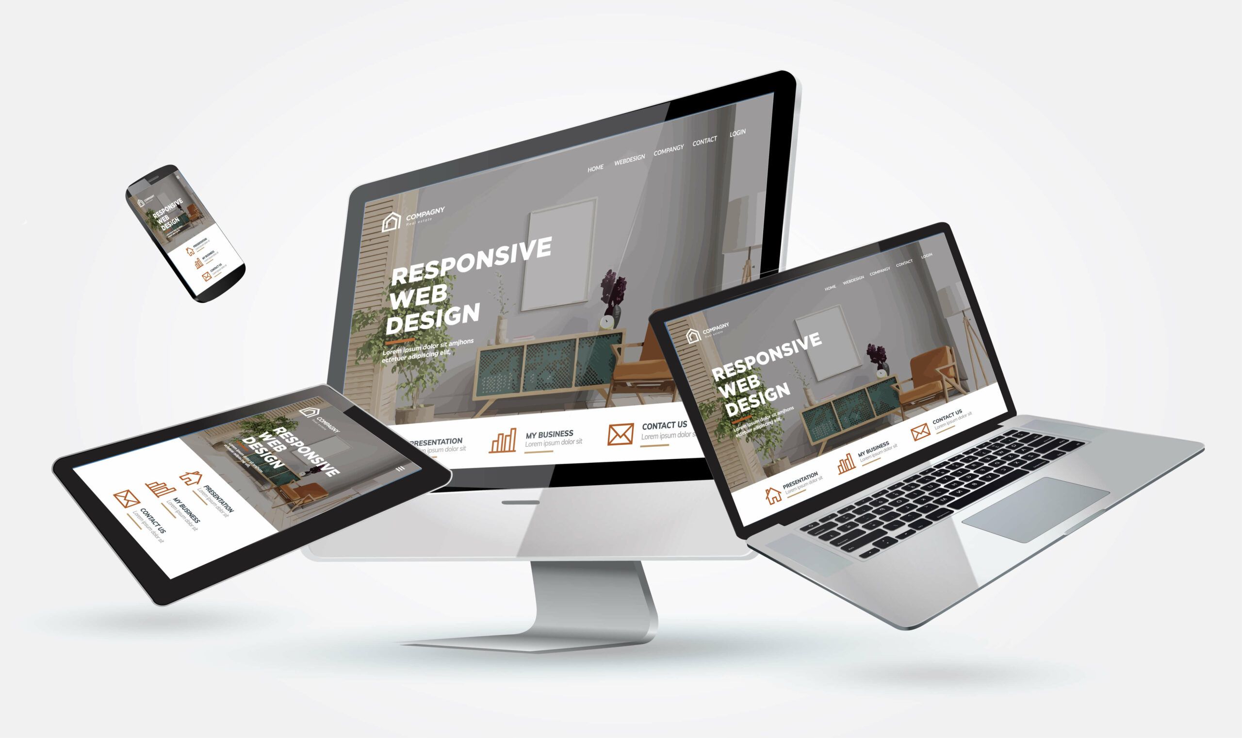
When you think of web design trends, what’s the first thing that comes to mind? Mobile-first? Thumb-friendly navigation? Responsive?
While those are all well and good and your website should absolutely be all 3, doing business online nowadays requires you to provide your audience with an immersive experience on your website.
Creatives often have a difficult time with trends. On the one hand, following the masses feels like the exact opposite of creativity. In that vein, knowing what’s hot and trendy can help you to know what to avoid. But on the other hand, “creativity is a wild mind and a disciplined eye” according to the wise words of Dorothy Parker. It’s evaluating all the amazing options out there and determining which ones best serve you and your brand. You should train yourself to understand how and why a trend has emerged and been adopted because at the end of the day, trends are history in the making.
In web design, it’s easy to know what’s trendy: just take a look at your smartphone which is likely already in your hand! We’ve picked the most prominent website design trends of 2019 and provided you with tips on how you can take that and make it your own.
Bucking Conventional Web Design Rules
What are design trends for if not to give convention a little shake-up?
Using natural, organic, imperfect shapes
Rather than going for the typical grid layout of most website templates, web design is moving towards the imperfect as designers are pulling away from the straight lines that come with flat design and experimenting with more fluid shapes and lines. And no, we’re not talking just your basic circle, square, rectangle, or any even-sided shape. We’re talking shapes that don’t even have a name, shapes that have shed their straight lines and instead emulate elements of life and nature. Geometric shapes provide structure while organic shapes evoke a feeling of life through the illusion of movement.
Pro Tip: Use shapes that represent your brand. For example, if you’re a company with a child-like brand image, take that into consideration as you develop the elements on your website.
Mixing serif and sans serif fonts
There’s been this unspoken rule since the start of the web that serif fonts are for print and sans serif are used on screen. Well, that’s being thrown out the window as website design takes a shift to more vintage and bolder typography styles (more on typography later). The biggest factor for this shift is the improvements in technology. Sans serif fonts were said to be more readable on screens, but with high def and high-res devices, reading serif fonts is no longer an issue.
Serif fonts are generally complete with thicker, bolder lines than some of the thinner sans serif fonts that have been popular over the years are lacking.
Pro Tip: Sans serif fonts are good for longer bouts of website copy but for smaller elements like headers, callouts, and even your brand logo, a bolder serif font adds decoration and emphasis.
Black and white color palettes
Color is an important element of a website: it inflicts a certain mood on its visitors, unifies the brand, and guides users through the interface. But what about a website that lacks color?
Without color, you notice things differently: textures, shapes, and you take things in slower. White on its own is clean and minimal while black is striking and assertive. When used together, a bold look is the result and, if done well, it no longer feels like a website design constraint as it helps to enhance the design and make for a more memorable experience for website users.
Pro Tip: Break up the monotony by adding an accent color. This can highlight landmarks to guide users on the path you want them to take throughout your website and make calls-to-action pop out.
Overlapping design elements
Similarly to the broken grid layouts and the embrace of asymmetry in website design, overlapping items are starting to be used to create visual interest when traditionally they were avoided for fear of a website looking cluttered. When done right, it actually has the opposite effect: it can truly enhance your website’s aesthetic.
Now, given the mobile-first emphasis of the Internet, it can be pretty difficult to properly execute this design feature as overlapping elements sometimes may not render properly on a mobile phone. All we can say is that it will take a bit of experimentation to find a design that looks as seamless on a computer as it does a phone.
Video Content
Nothing new and probably comes as no surprise to you but adding video content helps to diversify your page and cater to an on-the-go audience that doesn’t have time to sit and read a body of text. Just like with the daring website design elements we mentioned above, the videos of 2019 are bolder and more eye-catching than ever before. Videos are more attractive, grab your audience’s attention, and simplify storytelling.
Pro Tip: The key to creating the best video is to hook the viewer in the first few seconds and make it just as effective with sound as without (consider using captions and bold concepts that hook without sound). There are loads of ways you can place feature videos so be strategic about their placement. Videos are generally more product or service-focused as they can better construe to your website visitors exactly how your product or service works and how it will benefit them. Time-lapse or sequencing editing techniques are great for these types of videos because they will make your product appear easy to understand and use.
Minimalism: Less is More
“Good design is as little design as possible.” -Dieter Rams
Web design is moving towards a “less is more” mindset and designers are embracing simpler layouts with greater amounts of white space. White space – also referred to as negative space – is simply the empty space of a page. It doesn’t necessarily have to be white; think of it as the breathing room between each of the page elements. The fewer elements and content on your website, the less likely your audience is to be overwhelmed and click out of your site. Removing the clutter helps them to focus on what step you want them to take next, improves readability, and makes it easier to digest the most important information.
Pro Tip: Try using fewer elements and fonts, simplifying your color palette, and making navigation more obvious.
Experimental Navigation
Navigation is one web design trend that seems to change on a yearly basis and this is likely because it’s one of the most difficult elements of any given webpage. It’s an essential feature of a website but it’s hard to find a balance between making it both functional and aesthetically pleasing. There’s no right or wrong way to approach navigation other than to experiment, not only with font size, placement, and layout but also with making it a focal point of the website versus blending it into the interface.
Ever-Evolving Chatbots
Due to advancements in AI and machine learning, chatbots are becoming more intelligent and efficient. With the increase in the level of customization this allows, there’s been and will continue to be an influx of brand mascots that give the bots a personable face.
Pro Tip: If you don’t already have a brand mascot, think of a character that effectively represents your brand and consider how you can weave that into your chatbot feature. Think Clippy from Microsoft Word. And if you don’t already have a chatbot feature, you should strongly consider one as consumers are looking more and more for their questions to be answered and fast.
Creative Design Elements
Illustrations & Art
Stock photos can only take you so far and what they lack in creativity and versatility, illustrations make up for in their ability to give life to abstract concepts. Illustrations are flourishing in the tech industry as companies like Mailchimp, theSkimm, Etsy, Adobe, Dropbox, and many others embrace the exclusive nature of art and showcase collaborations with different designers and artists.
Pro Tip: Maybe you don’t have the funds to collaborate with a well-known illustrator and aren’t artistically savvy enough to create your own – we understand. There are illustration stock photos available all over the web that you can tweak and modify to fit your brand. But it’s important to know your audience and the message you’re trying to convey in order to curate the most appropriate visual.
Gradients
Gradients are awesome because they work on almost any website design style and work for those who may be a little more artistically challenged and have not yet embraced the illustrations and art we just talked about. They add a fun burst of color and can be used in so many different aspects of your website, namely the background, text, icons, buttons, product placement, etc. While in 2018, color gradients were popularly seen as a photo overlay tool, 2019 sees gradients in bright color choices used all over the webpage.
Pro Tip: Use colors that fade naturally into each other. Think green into blue, not green into red. Place the dark color at the bottom and the brighter color at the top.
Getting Creative with Typography
Typography has always been fundamental in website design – how else can your visitors get to know your brand? But now that the Internet has become so visual and reading bodies of text has become that much less appealing, there is a higher level of expression and experimentation as brands approach typography on their websites. It’s less so about choosing a specific font or font combination, and more about making words the main element of a webpage’s design; words are now the structural element around which the rest of the website’s design flows.
Pro Tip: Move beyond just font selection and play with using letterforms as a graphic element, applying different effects and animations, and combining different styles and weights with bold, italic, serif, sans serif, and outlined versions of the same font commingling in the same space.
There are countless examples of websites that utilize typography in awesome ways but here are a few of our favorites.
Organic Animations and Micro-Interactions
Videos have posed a problem for mobile users for years as they don’t always render properly which has brought about the popularity of timed animations which don’t result in increased loading time.
Micro-interactions play an important in user experience and can be used on clickable elements like buttons and navigations but also on the background like in the example below.
Pro Tip: Vectorial elements can be animated with morphing, imitating liquid, or bringing typography to life. There are tons of tools out there that can be used to elevate different aspects of your website design. The key is to not overdo it with these design effects. The goal is to streamline the user experience, not complicate it. Identify the most common interactions a user makes with your website and think of how you could improve that experience with animation.
Retro Website Design
All that is old becomes new again. The retro or nostalgic trend is no longer seen just in fashion when a notable style from decades ago comes back in again. What makes this especially interesting is website designs that reflect a time period before websites were even widely available which makes it all feel new again. Websites will pay homage to past times with elements like color schemes reminiscent of past design trends and outline typography which was popular in the past century.
Glitch art
With the return of glitch design, it’s hard to believe that in 2019, we’re nearing the end of the second decade of the 21st century – can you believe it?
Throwback to the times of slow dial-up connections, crinkled film resulting in a distorted yet striking image, and dropped calls. Glitch art like you see on the North Face website to the right draws the visitor’s eye to the elements that are warped, giving the site a psychedelic look.
Glitch art definitely isn’t for everyone and should be used sparingly on the most eye-catching visuals and callouts.
For help in your web design process, reach out to an expert in web design today!

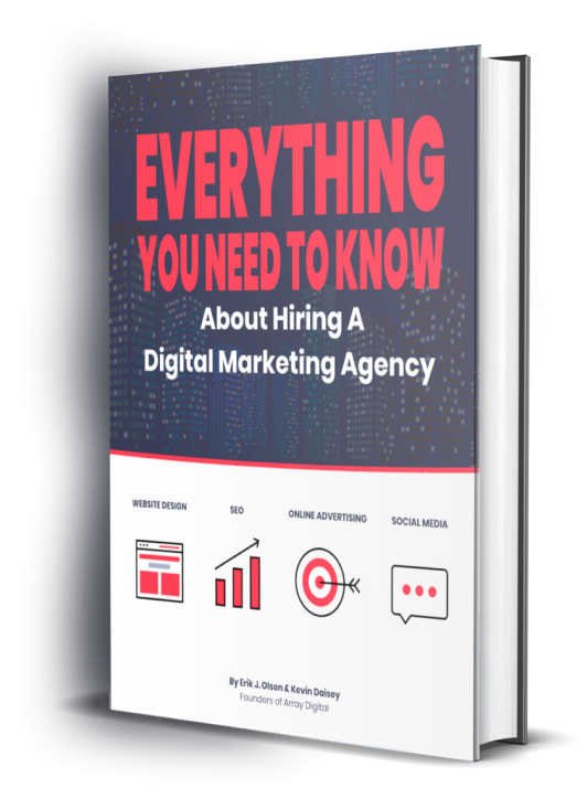
Everything you need to know about hiring a digital marketing agency:
- The four pillars of digital marketing
- Digital marketing options and costs
- The pitfalls to avoid
- What to expect when working with an agency
- The qualities to look for in a digital marketing agency


-

“Erik and the Array Digital team are top notch in the digital marketing spaces, particularly for SEO. Their understanding of Google, the algorithms, and the work involved to get websites ranking on the first page is unparalleled. Thank you Erik!!”
Andrew Zihmer -
“I had a chance to consult with Kevin Daisey for my law firm’s marketing needs. He is knowledgeable, kind, and helpful. He provided me with a great marketing analysis. He also invited me to their podcast as a guest speaker. Thank you Array Digital!”
Merve Kati -
“The legal profession needs more architects and designers…folks who are thinking about the future of the profession and who are assembling a tribe of like minded lawyer leaders. Erik and his team are certainly ‘that’.”
Ben Glass